Build and Style a Reloops Collection: Step-by-Step Guide
Create a collection, pick your source project or folder, tune the layout for your audience, and share a polished asset gallery in minutes.
Building a collection takes four steps: create the collection, point it at a source, tune how the assets look, and share the result. Because a collection is a view over your existing project files, you can adjust or rebuild it at any time without affecting the originals. Find all your collections at /workspace/:workspaceId/collections and open any individual collection at /workspace/:workspaceId/collections/:collectionId.
1
Create or open a collection
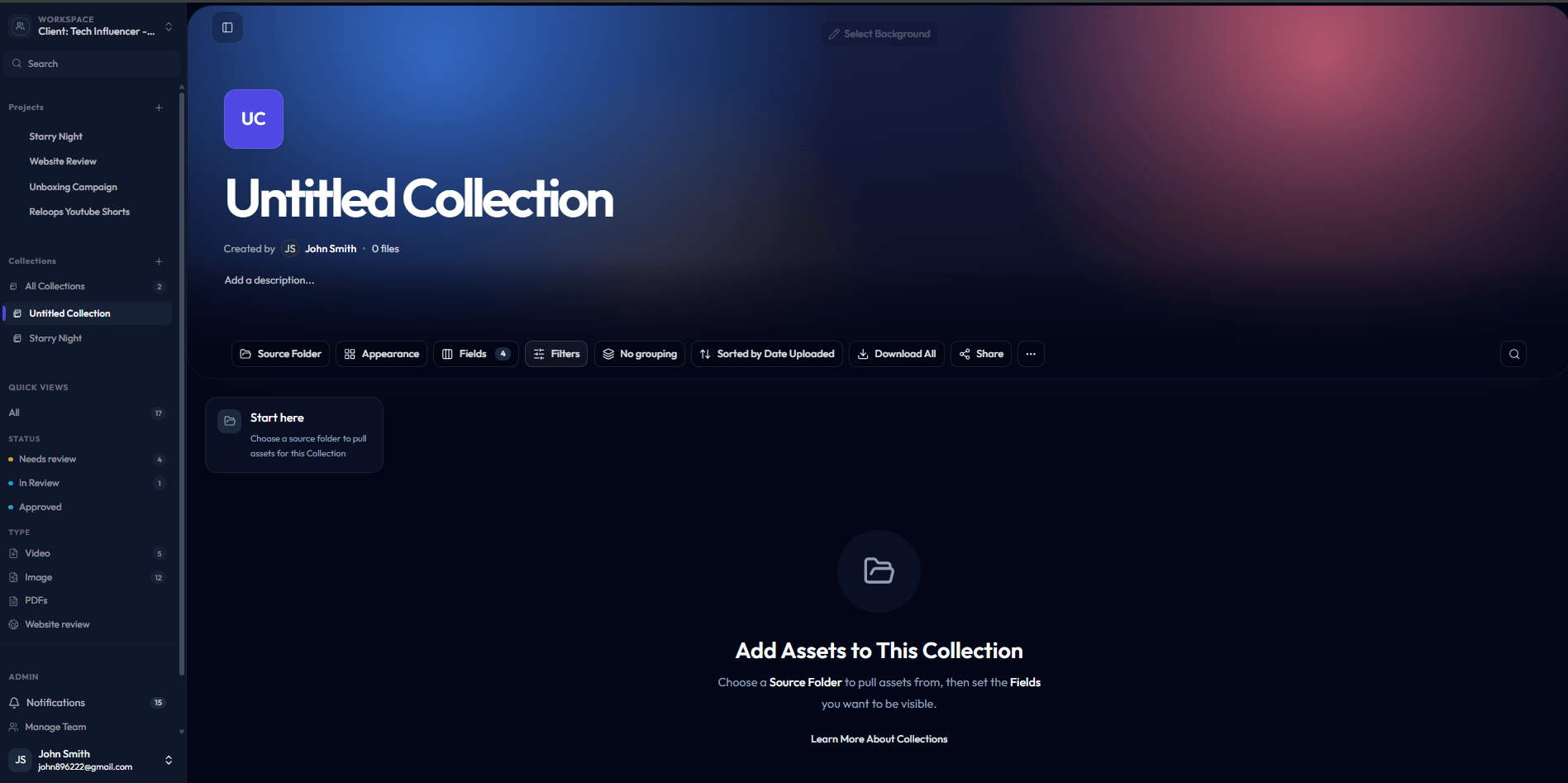
Go to Collections in the left sidebar and click New collection. Give it a name that reflects its purpose - for example, Spring Campaign - Client Review or Final Selects Q2. If you’re returning to an existing collection, click its name in the list to open it.An empty collection opens with a prompt to add your first source. You won’t see any assets until you complete the next step.
An empty collection prompts you to pick a source.
2
Use the source picker to choose a project or folder
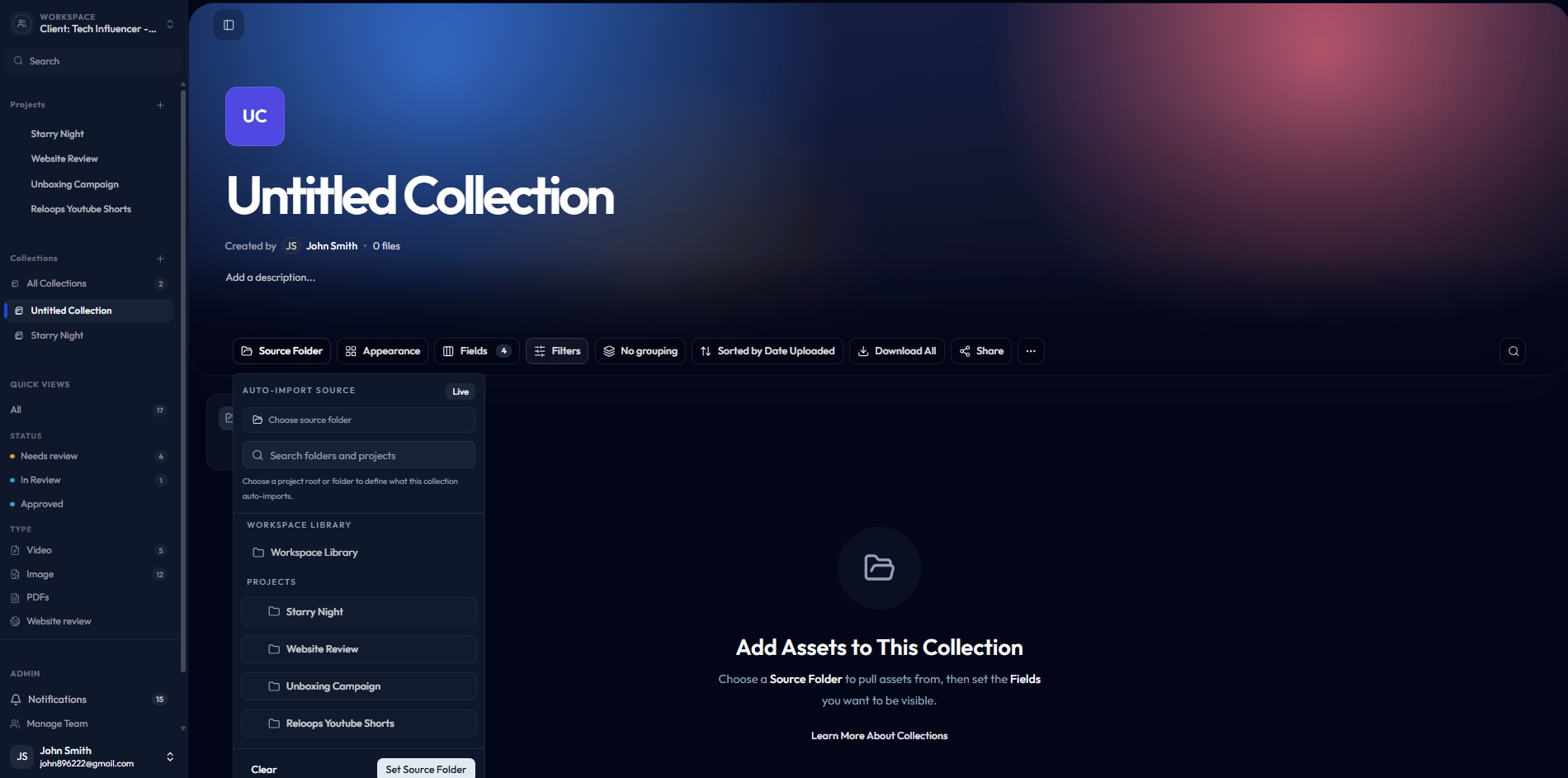
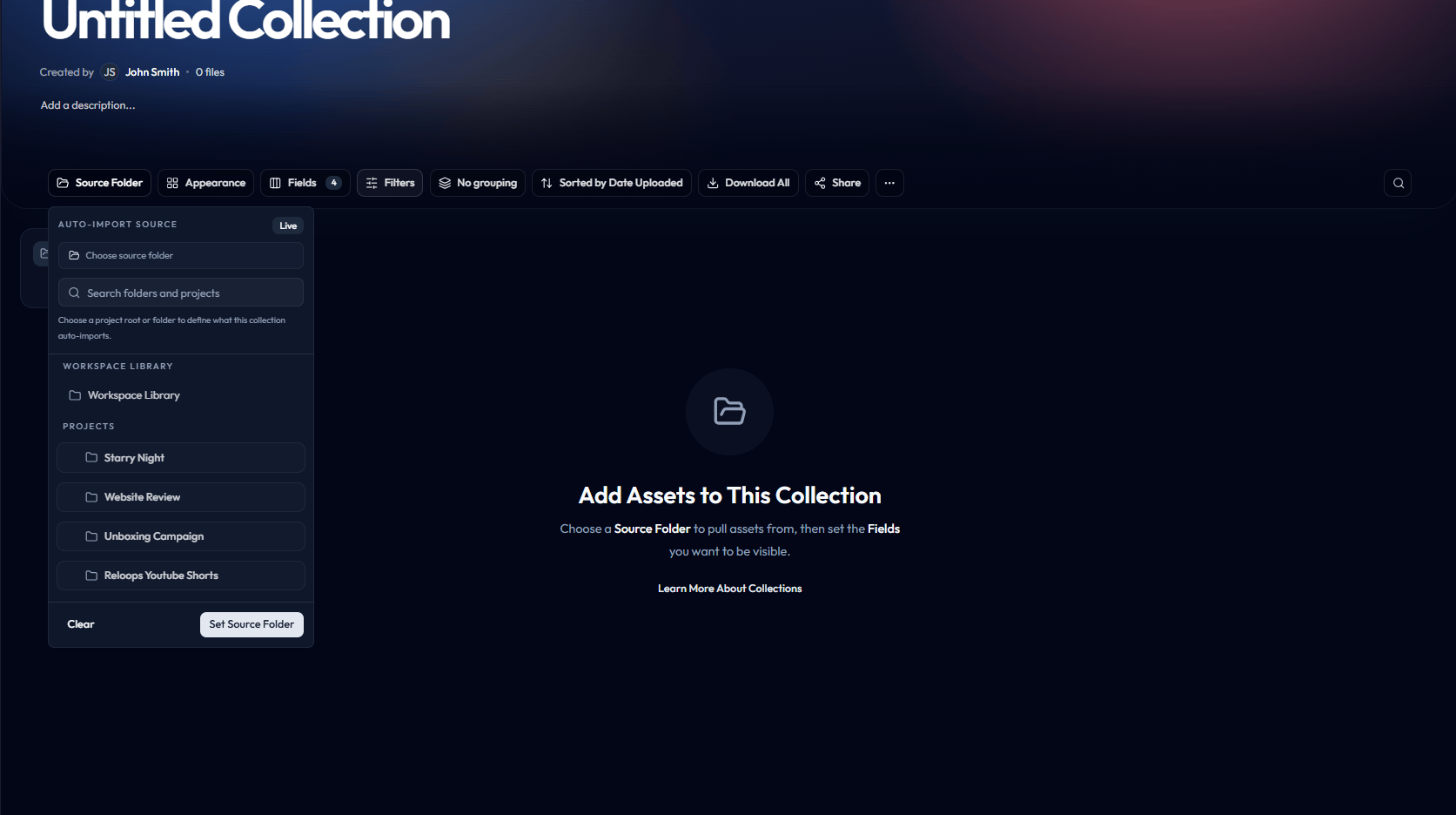
Click Add source (or the prompt in the empty state) to open the source picker. Browse your workspace projects and select the project or specific folder whose assets you want to include.Once you confirm, Reloops pulls the assets from that source into the collection grid. You can add multiple sources to a single collection - for example, combining a hero-image folder from one project with a product-shot folder from another.
Source picker showing the project and folder tree.
A folder selected and ready to add as a collection source.
3
Tune the layout using appearance settings
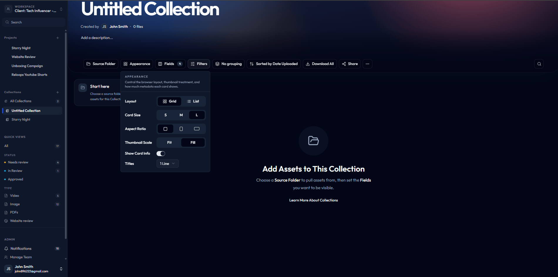
Open the Appearance popover (the settings icon in the top-right of the collection view) to control how the grid looks for your audience.
Dense cards show more assets per row with compact metadata - useful for internal teams scanning a large shoot.
Clean gallery uses larger thumbnails with generous spacing - the right choice for client-facing presentations where visual impact matters most.
Adjust card size, spacing, and any visible metadata labels until the layout matches your intent. Changes apply live, so you can preview the result as you go.
The Appearance popover controls layout, card size, and spacing.
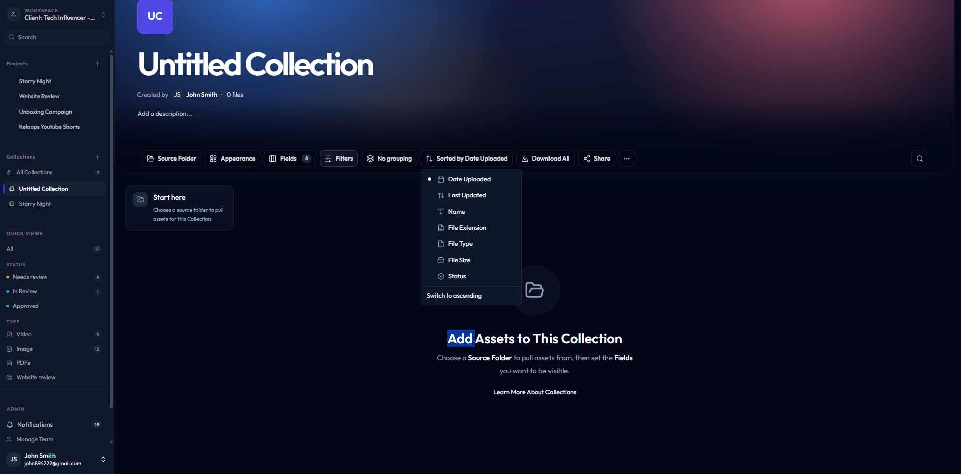
Use the sort menu to reorder assets inside the collection.
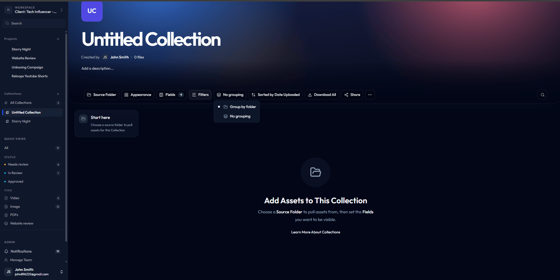
Group assets by project, folder, or status using the grouping menu.
4
Share or present the finished collection
When the collection looks right, share it with your audience. Use the Share button to generate a collection share link. Set expiration, decide whether downloads are allowed, and choose whether recipients can comment. Recipients see the styled gallery view you built - not the underlying project folders.Return to this collection any time to refresh the source, update the appearance, or add new assets as the project evolves.